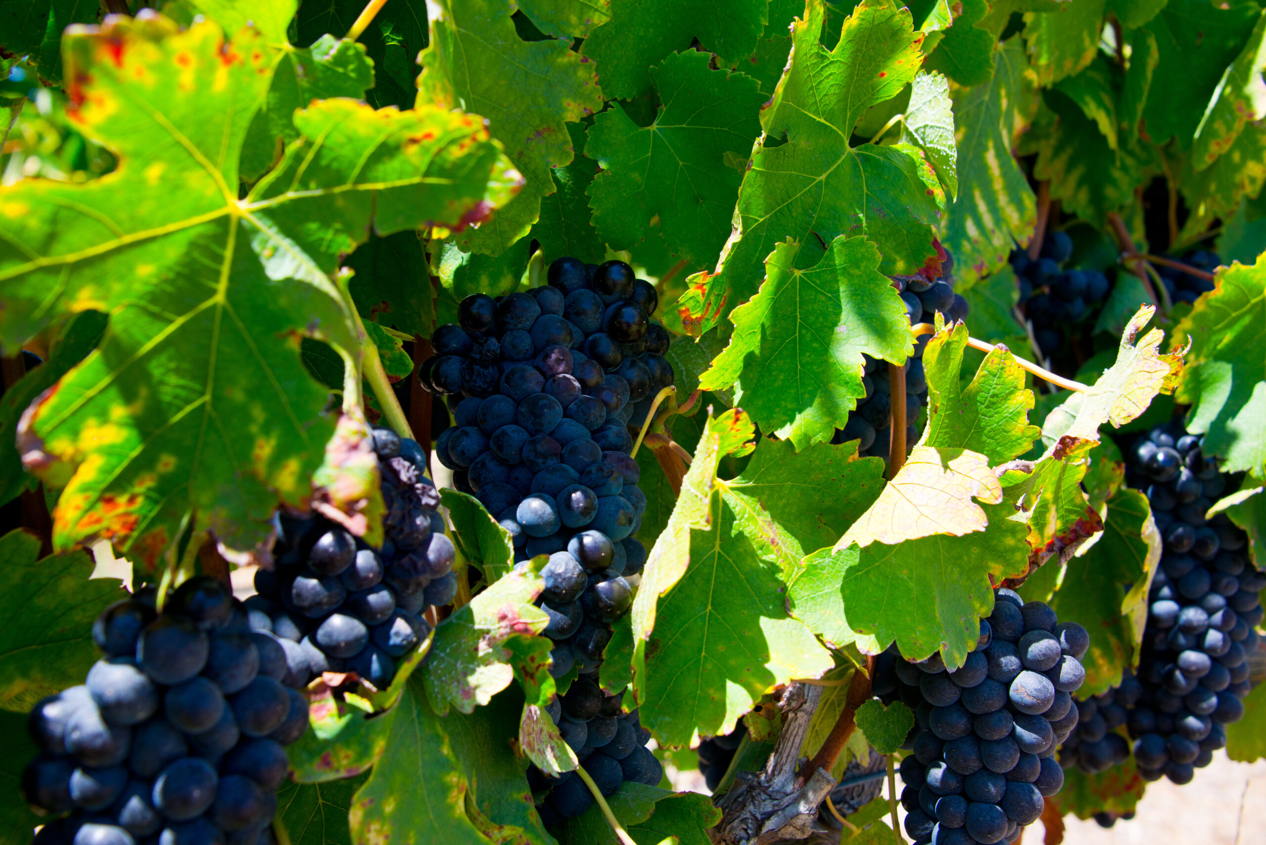
Let’s be honest, we all judge a book by its cover.
In the wine world, the “cover” or label on a wine bottle is arguably the most important part of the entire package. Why? The label is the first thing you see when trying a new wine. Before knowing what the wine tastes, smells, or looks like, the label has to grab your attention. It must have shelf appeal.
In theory, creating a wine label to match the quality of the wine sounds simple. Much to our surprise, it was quite the opposite. For us at Untamed, creating an eye-catching and quality label was one of the most challenging yet rewarding experiences we have faced so far in creating our brand. We began our label design in March of 2019 and just completed the design of our final label, over a year and a half later. In case you’re interested, I’ve summarized the steps we went through below:
___________________________________________________
Step 1: Finding our logo
For us, the idea of “Untamed” represented the culmination of our wine knowledge which allowed us to break free of the corporate world and create an innovative production winery of our own. A simple Google search of the word “Untamed” said otherwise. We realized the logo present on each wine label had to express the quality we found in the word and not what Google dictated.
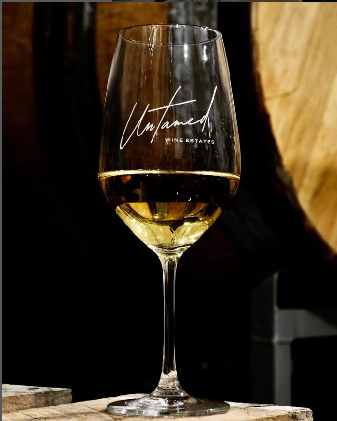
We worked with a specialized design team out of Austin and after months of logo design, we decided on the one below (see if you can guess our subliminal message):
A logo that is simple, classic, but still subtly representative of our version of “Untamed” (incase you haven’t noticed, the word “Untamed” breaks free of the surrounding box, preferring to color outside of the lines).
___________________________________________________
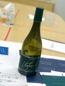
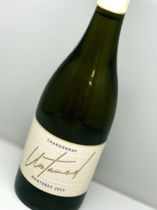
Step 2: Back label
I would like to know the statistics to the amount of people that actually read the back wine label. Bonus points for those that do read it, because you appreciate the hours of effort it requires to write a simple 3 sentence description.
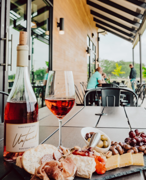
The description on the back of each wine label is comparable to a summary on a book’s back cover. You want to provide an overview of the product and leave the reader with a desire to consume what’s inside. On all of our back label’s you will see a brief description of our brand, our style, and winemaking practices. We leave the tasting notes up to you.
___________________________________________________
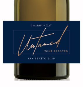
Step 3: Colors
This year I learned what the word “Pantone” means. Light blue is not just called “light blue,” but named PANTONE 915 U instead.
The amount of colors available is overwhelming and choosing the right color is where the game of trial and error heightened. Different shades of color, room lighting, bottle shape, and even your own mood alter what you see in a label color. We still were perfecting the Pantone color and shade on the actual day of printing.
___________________________________________________
Step 4: TTB, TABC, COLAS
If you haven’t guessed it already, Step 4 was all about the government regulations and fees. Regulations included AVA location, vintage year, varietal, and government warnings. Surprisingly, this step went very smoothly and we were able to add unique varietal names and winemaking techniques used to produce our wines. Look out for our wines showcasing “Steen,” “Fumé Blanc,” and “Methode Cap Classique.”
___________________________________________________
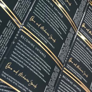
Step 5: The printing finale
This was by the far the best part of this whole experience. On official printing day, our Untamed team flew out to our label printing company. The facility was impressive – massive equipment, knowledgable staff, friendly environment.
Printing took the entire day. Each label was individually checked and re-checked before proceeding with the final label.
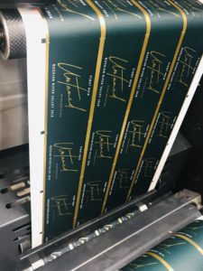
We ran into one hiccup with the contrast of our Chardonnay label, but with the help of the staff onsite, we were able to easily come up with a solution.
___________________________________________________
After years of planning, building, and producing, it finally feels like we are making progress. Physically seeing the result of all our hard work brings an indescribable sense of accomplishment. There are many more milestones ahead, especially as we draw near to our opening date…
More updates to follow, but in the meantime:
Dare to Live UNTAMED